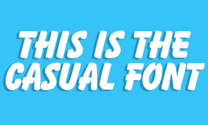
 In the days before desktop publishing, magazines and newspapers were limited to the typefaces they could use. Most relied on Letraset to physically stick down each letter they needed, so much so that the first issue of the Sun had to be creative with headlines as they could only afford three big ‘E’s. In those days, the Casual font was much used as it was perhaps the only typeface that looked a bit like normal handwriting. Of course, it was just as uniform as your bog-standard Times New Roman, but somewhere along the line it became the official font of comics. Whizzer and Chips certainly embraced it with gusto, using it in every speech bubble and caption, and most other comics liked its juvenile quality. It also came to represent everything to do with school, especially when Grange Hill decided to use it for their end credits. The move was swiftly mimicked by more or less every other children’s programme. When Microsoft Word became commonplace, the Casual font started to fall out of favour, and for the most part was replaced by the ubiquitous Comic Sans. Nowadays this font can most often be seen when an office manager is trying to make that demand not to steal their biscuits just a little bit more friendly.





Andy Parker
August 6, 2012 at 11:49 pm
Was watching the Olympics today and was very impressed to see one of the Iranian atheletes in the 1500m wearing a vest with IRAN on it in the Casual Font.