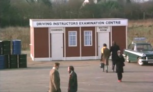
 This gets a little technical, but bear with us, there is a point to it all somewhere. Dating decades by the film or video stock they’re most often recorded on isn’t an exact science, but it’s a fair rule of thumb that if it fuzzes with not-quite-there-yet video brightness, the programme you’re watching is from the ’80s, when video cameras first stalked the land outdoors as well as in. Likewise, if it’s not in black-and-white, your ’60s or ’50s film will most likely be shot in the elaborate and much-mourned Technicolor process, producing those hot pinks and azure blues that make everything look like an all-American advert for the latest ‘frigidaire’, even if the subject is just Cliff and Hank Marvin trying to chat up Una Stubbs on the first bus out of Borehamwood.
But in between – what, exactly? Think of ’70s films, those murky browns and very deep greens, grainy shots of traffic, skies that look overcast even when the sun’s out. That’s Eastmancolor, Kodak’s cheaper rival to the elaborately processed, lighting-hungry methods of the Technicolor boys, which had all but ousted its rival by the end of the 1960s, bringing costs down, and the colour palette with it. Purists moaned their usual low moans of aesthetic doom, but look at it this way – is there a more honest way to depict those times? Grainy, brown-tinged, and seemingly half faded away even when the film’s just come back from the chemist’s – well, those are our memories of the 1970s, at least. (Except when we went indoors, of course, when everything suddenly became really bright and colourful, and in front of a studio audience. But that’s another story.)






Adrian
September 14, 2009 at 9:41 am
Top Of The Pops was a pot pouri of film types/colours: The black and white film of the late 60s, where bright spots are turned black by the camera, and the early colour transmissions in the 70s where bright lights left a trail on the screen as the camera panned around..
Timothy Lea
September 15, 2009 at 10:29 am
Is that still from Confessions of a Driving Instructor?
Richard Davies
August 9, 2010 at 5:05 pm
I remember well into the 1980s a lot of programmes had grainy exteriors & super-sharp interiors.
Eventually shows either went all videotape, or all film with better quality film stock. One Foot In The Grave was the last show I can think of that had a mix of styles.
It’s confusing that some shows today are shot on videotape & then tinted to look like film.
The out-takes on The Office DVDs show what the “before” looks like.
Glenn A
August 9, 2010 at 5:10 pm
I have been watching the second series of Auf Wiedersehen Pet, made in 1985, and I concur with Richard that the location fiming does look grainy and a bit washed out in places, while the studio based parts of the show have much sharper colour quality.
johnnyboy
December 19, 2010 at 12:52 am
Must be due to the fact that when outside, handheld 16mm film cameras were used while inside you could get it right with those huge video cameras on the wheely telescopic mounts that glid (glided?) around on the studio floor.
Merly pixie.
June 5, 2011 at 6:53 pm
What is name of film?.
Jill Sandwich
July 11, 2011 at 2:05 pm
10 slaps with a trout for the Monty Python reference!
damian
February 10, 2013 at 2:56 pm
even in the 21st century I still write off whole days for not being properly overcast like they always seemed to be in the seventies
Glenn Aylett
July 12, 2020 at 11:55 am
I have been watching repeats of The Saint from the late sixties, which were shot on 35 mm film in colour, and they actually stand up quite well for such old programmes as the colour is neither overpowering nor washed out, as was the case with many early colour programmes. It did seem the move to colour for ITV shows that were exported to America from 1966 onwards were near Hollywood quality.
richardpd
July 12, 2020 at 12:09 pm
The Prisoner has mostly decent colour, though the prints have been cleaned up for the Blu-ray set I have rather than worn copies that have been doing the rounds for years.
I did read that AP films struggled when moving to colour to make Stingray, as some the colours they chose for the props & sets were a bit garish for the film stock to cope with, especially when broadcast on NTSC.
Luckily they shot some test footage before filming any episodes & managed to changed the offending colours before starting on any full episodes.
Certainly by the time Gerry Anderson made Thunderbirds & Captain Scarlet the colour was looking very good.
Droogie
April 16, 2024 at 1:57 am
This is so wrong ! I believe TV Cream are confusing the muddy grainy colour palette of 60’s/70’s British movies with our overcast miserable weather rather than it being the fault of EastmanColor. For wonderfully sharp colour-saturated movies shot in Eastmancolor, check out The Mouse That Roared, Peeping Tom, The Umbrellas Of Cherbourg, Help!, 2001 and A Clockwork Orange for a start.
Glenn Aylett
April 18, 2024 at 9:31 am
Eastmancolor was probably a godsend for the cash strapped British film industry, which was still using black and white for the majority of its films at the start of the sixties, while American films were nearly all in colour by 1960. Using Eastmancolor saved on the cost of making colour films and made British films look less cheap and parochial.