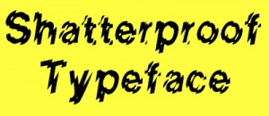
 OK, so technically speaking it’s called Glass Houses, but the eyecatching, diagonally refracted, jittery typeface (never ‘font’ before 1985) in question was most famously seen proclaiming Helix rulers to be ‘Shatterproof’, which indeed they were (they were easily bent out of shape, though), so as well as being a design classic it held no small amount of authority. Said authority was later undermined by its employment on the boxes of numerous cheapo video nasties which promised the grisly world but delivered a big spine-tingling sod all, but what the hey.







Mark Jones
September 26, 2009 at 10:22 pm
Excitingly, the Shatterproof typeface is making a bit of a comeback, appearing on the cover of the new Weezer album:
http://en.wikipedia.org/wiki/File:Weezer-Raditude.jpg
Tim
January 31, 2010 at 8:17 am
That is Letraset’s venerable Shatter, Glasshouses is a rip-off.
http://www.letraset.com/design/shopdisplayproducts.asp?id=506
Lee James Turnock
May 20, 2010 at 5:14 pm
Excellent use of Shatterproof…
http://i30.tinypic.com/1441hud.jpg
Adrian
August 11, 2022 at 3:05 pm
Amuse Bouche: A ‘No Entry’ sign which I designed for work was rejected by the head of department on the grounds that it was ‘too scary’ (it incorporated a skull and crossbones as well as the aforementioned ‘Shatterproof’ font described above..